| 리액트 네이티브 튜토리얼 |
| [#1 리액트 네이티브 맛보기] |
| [#2 Component와 메인화면 분할] |
| [#3 레이아웃 구성하기] |
| [#4 레이아웃 구현 마무리하기] |
| [#5 state] |
| [#6 설정 Modal 만들기] |
| [#7 설정 Modal 기능 추가하기] |
| [#8(구현 끝) 채팅기능 구현하기] |
안녕하세요!
올해 1월에 #3까지 작성한 후, 업로드를 하지 못하였는데 마무리는 지어야 할것 같아 다시 글을 작성합니다!
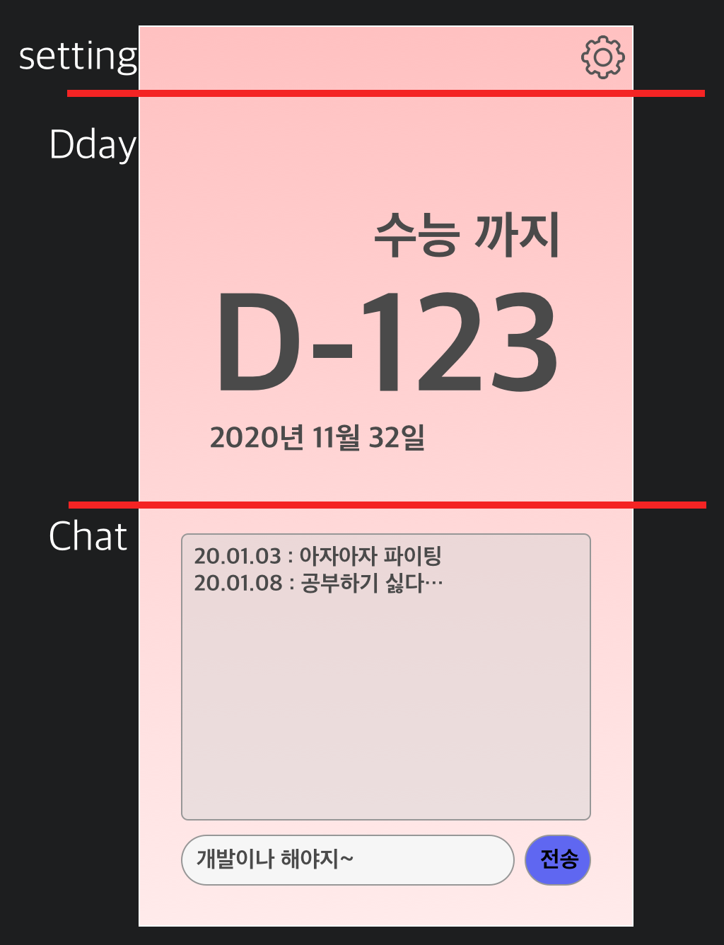
#3까지 진행하면서 setting과 Dday부분은 뷰가 완성되었어요.
이제 Chat부분을 작업해볼거에요.
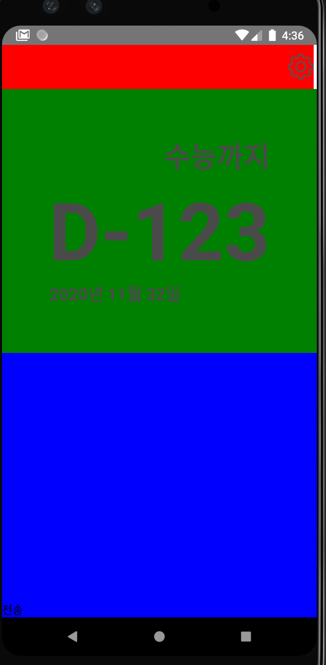
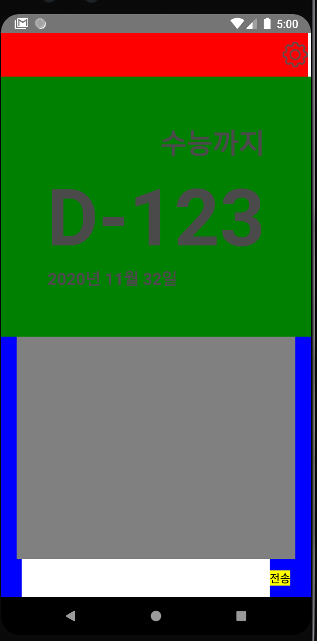
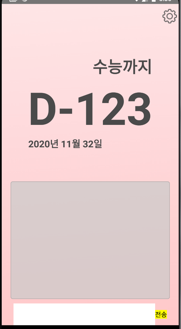
현재 전송버튼은 보이는데 입력값을 받을 Input은 화면엔 보이지 않아요.
그 이유는 width를 지정해주지 않았기 때문이에요.
//App.js
const styles = StyleSheet.create({
  sendButton:{
    backgroundColor: 'yellow',
  },
  chatInput: {
    backgroundColor: 'white',
    width: '80%',
  }
});
버튼과 input의 스타일을 작성해준 뒤, style prop에 해당 스타일을 적용시켜 주세요.
width: '80%'처럼 길이부분에 %를 주면 몇 %를 차지할 것인지를 정해줄 수 있어요.
즉 화면의 가로길이의 80%를 input의 너비로 쓰겠다는 뜻이에요.
      <View style={styles.container}>
        <View style={styles.settingView}>
          <TouchableOpacity>
            <Image source={require('./icon/setting.png')}/>
          </TouchableOpacity>
        </View>
        <View style={styles.ddayView}>
          <Text style={styles.titleText}>
            수능까지
          </Text>
          <Text style={styles.ddayText}>
            D-123
          </Text>
          <Text style={styles.dateText}>
            2020년 11월 32일
          </Text>
        </View>
        <View style={styles.chatView}>
          <ScrollView>

          </ScrollView>
          <TextInput style={styles.chatInput}/>
          <TouchableOpacity style={styles.sendButton}>
            <Text>
              전송
            </Text>
          </TouchableOpacity>
        </View>
      </View>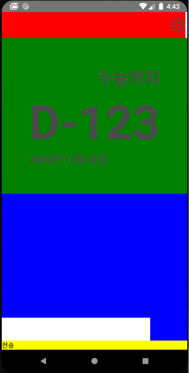
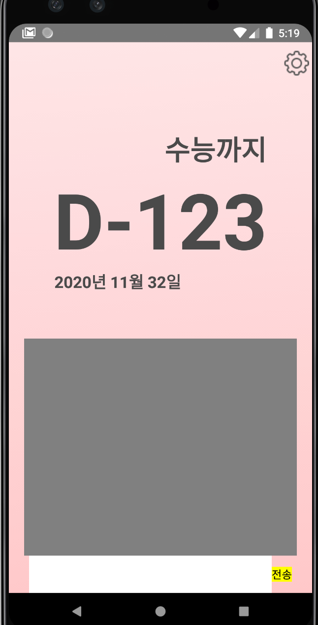
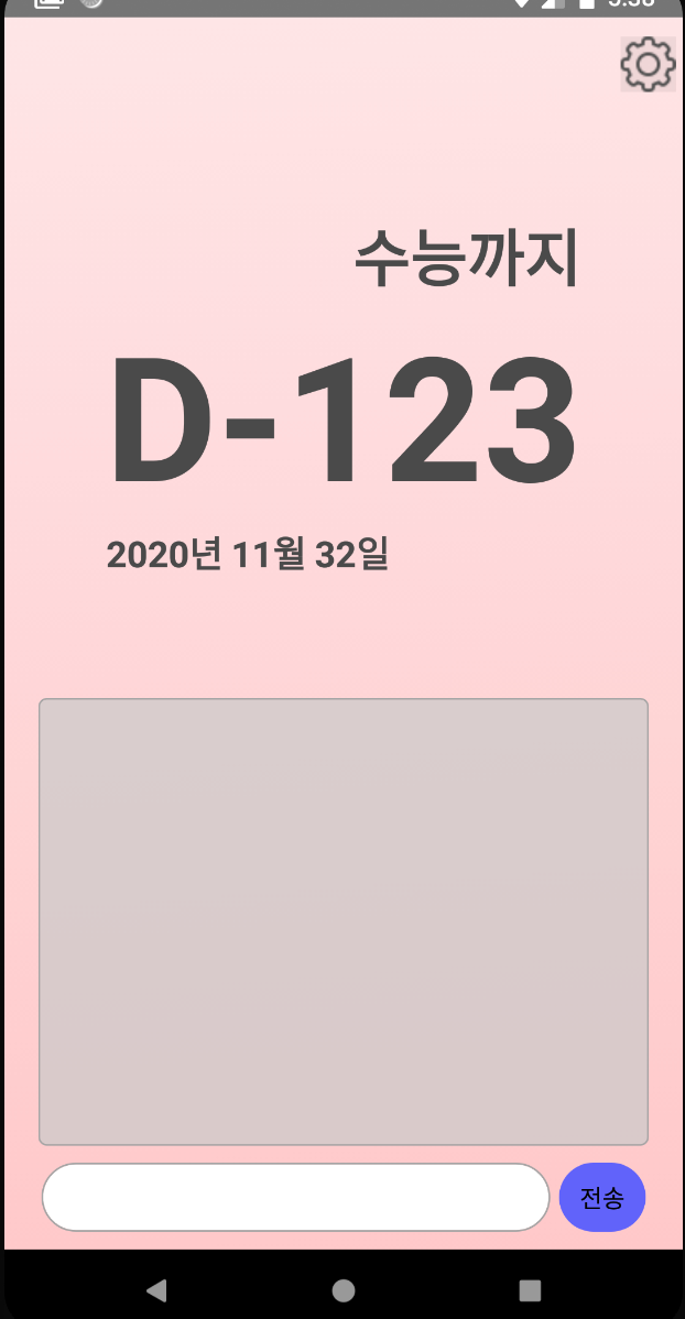
전송버튼과 input이 잘 보이는것을 확인할 수 있어요.
하지만 input과 버튼은 가로로 배열되어야하는데, 세로로 배열되어있어요.
이전시간에 배웠던 flex-direction을 이용해 가로로 배열해 줄거에요.
//App.js

  chatControl: {
    flexDirection: 'row',
    alignItems: 'center',
    justifyContent: 'center',
  }
아까와 마찬가지로 styles에 chatControl을 추가해줍니다.
요소들을 가로로 정렬하기 위해 flexDirection: 'row'를 작성하고,
각 요소들을 가로 세로 중앙 정렬을 해주세요.
// App.js
	<View style={styles.chatView}>
          <ScrollView>

          </ScrollView>
          <View style={styles.chatControl}>
            <TextInput style={styles.chatInput}/>
            <TouchableOpacity style={styles.sendButton}>
              <Text>
                전송
              </Text>
            </TouchableOpacity>
          </View>
        </View>
input과 전송버튼을 감싸는 View를 하나 생성해서 chatControl스타일을 적용시켜주세요.
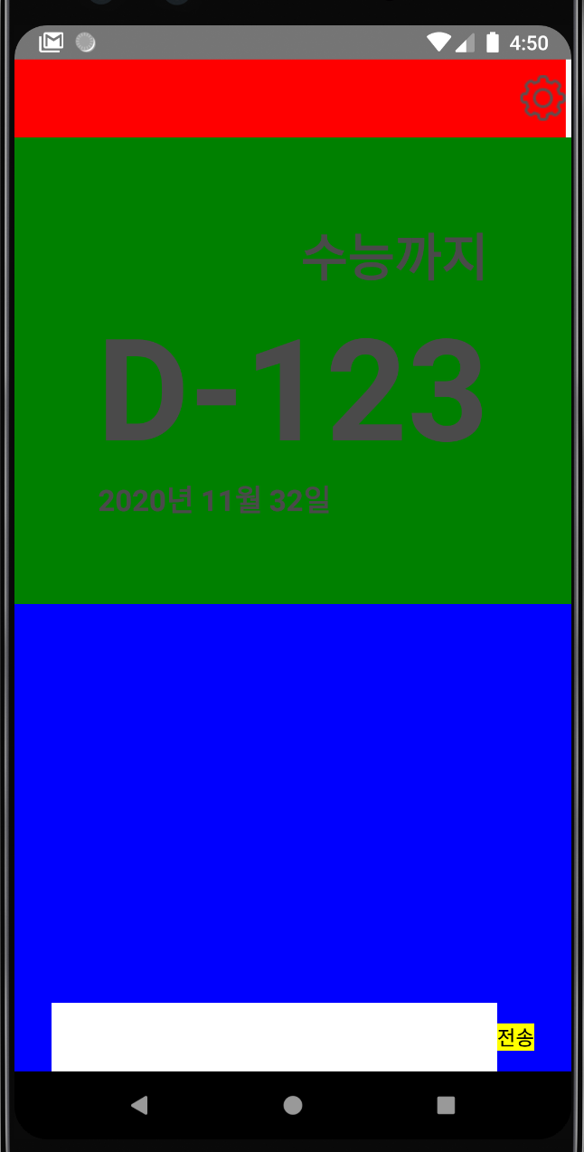
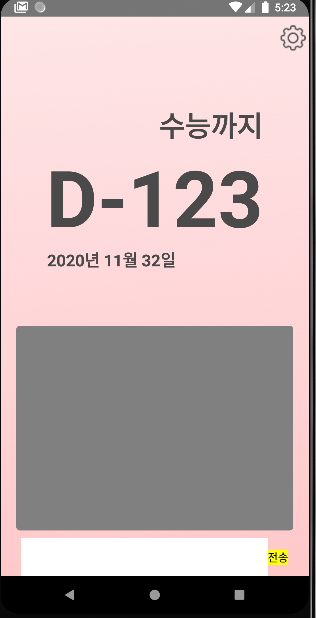
이제 작성했던 채팅이 보일 ScrollView를 꾸며줄거에요.
//App.js

  chatScrollView: {
    width: '90%',
    alignSelf: 'center',
    backgroundColor: 'grey',
  }
똑같은 방법으로 chatScrollView라는 스타일을 만들어주세요.
가로길이를 90%로 설정하고 alignSelf를 사용해서 가로 정렬을 해주세요.
// App.js
        <View style={styles.chatView}>
          <ScrollView style={styles.chatScrollView}>
          </ScrollView>
          <View style={styles.chatControl}>
            <TextInput style={styles.chatInput}/>
            <TouchableOpacity style={styles.sendButton}>
              <Text>
                전송
              </Text>
            </TouchableOpacity>
          </View>
        </View>
style props에 적용해주세요.
이제 모든 레이아웃의 작업이 끝났습니다!
각 뷰를 구분하기 위해 지정했던 배경색을 다 지우고 기존 디자인의 배경을 삽입해볼게요.
const styles = StyleSheet.create({
  container: {
    flex: 1,
  },
  settingView: {
    flex: 1,
    justifyContent: 'center',
    alignItems: 'flex-end',
    marginRight: '1%',
  },
  ddayView: {
    flex: 6,
    justifyContent: 'center',
    alignItems: 'center',
  },
  chatView: {
    flex: 6,
  },
  titleText:{
    alignSelf: 'flex-end',
    fontSize: 36,
    fontWeight: 'bold',
    color: '#4A4A4A',
    marginRight: '15%',

  },
  ddayText: {
    fontSize: 100,
    fontWeight: 'bold',
    color: '#4A4A4A',
  },
  dateText: {
    alignSelf: 'flex-start',
    fontSize: 21,
    fontWeight: 'bold',
    color: '#4A4A4A',
    marginLeft: '15%',
  },
  sendButton:{
    backgroundColor: 'yellow',
  },
  chatInput: {
    backgroundColor: 'white',
    width: '80%',
  },
  chatControl: {
    flexDirection: 'row',
    alignItems: 'center',
    justifyContent: 'center',
  },
  chatScrollView: {
    width: '90%',
    alignSelf: 'center',
    backgroundColor: 'grey',
  }
});
settingView, ddayView, chatView에 있던 backgroundColor를 지워주세요.
위의 배경으로 쓰일 사진을 다운받아서 프로젝트 폴더에 images라는 폴더를 생성하고 생성한 images에 넣어주세요.
// App.js
import { StyleSheet, Text, View, Image, TextInput,TouchableOpacity, ScrollView, ImageBackground} from 'react-native';
App.js의 상단에 ImageBackground를 import해주세요.
ImageBackground 컴포넌트는 감싸고 있는 컴포넌트들의 배경 이미지를 렌더링 해주는 역할을 해요.
// App.js

      <View style={styles.container}>

      // 이부분 추가!
        <ImageBackground
          style={{width: '100%', height: '100%'}}
          source={require('./images/background.png')}>
        <View style={styles.settingView}>
          <TouchableOpacity>
            <Image source={require('./icon/setting.png')}/>
          </TouchableOpacity>
        </View>
        <View style={styles.ddayView}>
          <Text style={styles.titleText}>
            수능까지
          </Text>
          <Text style={styles.ddayText}>
            D-123
          </Text>
          <Text style={styles.dateText}>
            2020년 11월 32일
          </Text>
        </View>
        <View style={styles.chatView}>
          <ScrollView style={styles.chatScrollView}>
          </ScrollView>
          <View style={styles.chatControl}>
            <TextInput style={styles.chatInput}/>
            <TouchableOpacity style={styles.sendButton}>
              <Text>
                전송
              </Text>
            </TouchableOpacity>
          </View>
        </View>
        // 닫는 태그는 여기!
        </ImageBackground>
      </View>
우리가 만들었던 모든 뷰를 감싸도록 ImageBackground를 작성해주세요.
style을 우리가 기존에 했던것 처럼 StyleSheet로 적용할 수도 있지만, 위처럼 따로 작성하지 않고 직접 적용을 해줄수도 있어요.
변하지 않을 width나 height등 간단한 스타일만 적용할 경우 이렇게 하는 것이 편할 때도 있습니다!
그리고 source에 아까 images에 넣어줬던 background.png를 적용시켜 주세요.
이제 얼추 완성이 되어가는 느낌이 납니다 ㅎㅎ
마지막으로 scrollView와 input부분을 적용시키고 마무리하겠습니다.
만들고자 하는 디자인을 보시면 chat부분의 모서리가 둥글둥글한 것을 볼 수 있는데, 이거는 borderRadius를 적용시키면 돼요.
// App.js
  chatScrollView: {
    width: '90%',
    margin: 10,
    alignSelf: 'center',
    backgroundColor: 'grey',
    borderRadius: 5,
  }
chatScrollView부분의 borderRadius를 5정도 주게되면 아래처럼 둥그런 모서리로 바뀝니다!!
input과 거리를 띄우기 위해서 margin도 10정도 줄게요.
그리고 살짝 투명한 배경색을 지정하고 싶을 때는 rgba를 이용하면 돼요.
// App.js
chatScrollView: {
    width: '90%',
    margin: 10,
    alignSelf: 'center',
    backgroundColor: 'rgba(201,201,201,0.7)',
    borderRadius: 5,
  }
rgba는 rgb값과 alpha값을 받아서 투명한 색을 만들어줘요.
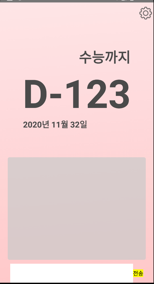
이제 회색 테두리를 만들어줄건데, border를 이용할 거에요.
// App.js
  chatScrollView: {
    width: '90%',
    margin: 10,
    alignSelf: 'center',
    backgroundColor: 'rgba(201,201,201,0.7)',
    borderRadius: 5,
    borderWidth: 1,
    borderColor: '#a5a5a5',
  }
borderWidth로 테두리의 두께를 설정하고, borderColor로 테투리의 색상을 지정해주면 돼요.
이제 input과 버튼을 꾸며볼게요.
// App.js

sendButton:{
    backgroundColor: 'rgb(97,99,250)',
    height: 40,
    width: 50,
    borderRadius: 20,
    padding: 5,
    justifyContent: 'center',
    alignItems: 'center',
    marginLeft: 5
  },
  chatInput: {
    backgroundColor: 'white',
    width: '75%',
    height: 40,
    borderWidth: 1,
    borderColor: '#a5a5a5',
    borderRadius: 20
  },
  chatControl: {
    flexDirection: 'row',
    alignItems: 'center',
    justifyContent: 'center',
    marginBottom: 10,
  },
sendButton의 backgroundColor를 바꿔주고, height, width를 지정해주었어요. 마찬가지로 둥그런 모서리를 적용해주고, padding을 줘서 모서리와 텍스트사이의 간격을 주었습니다. 그리고 marginLeft를 이용해서 input과 좀 떨어지게 해줬어요.
chatInput의 경우 너비가 너무 길어 75%로 조정해주고, 마찬가지로 height를 설정한뒤, 둥그런모서리를 적용해주었습니다.
chatControl에는 marginBottom을 주어 하단부에서 조금 떨어지게 해주었어요.
이제 레이아웃은 모두 완성되었습니다!
앞으로 핵심적인 앱 기능을 구현하면 끝이네요 ㅎㅎ
다음시간에는 state를 사용하는 법을 알아보도록 할게요
'Develop > React-Native' 카테고리의 다른 글
| [#6 설정 Modal 만들기] 환경 구축부터 스토어 출시까지 디데이 앱 따라 만들며 배우는 React Native (2) | 2020.11.15 |
|---|---|
| [#5 state] 환경 구축부터 스토어 출시까지 디데이 앱 따라 만들며 배우는 React Native (0) | 2020.09.30 |
| release 버전에서 axios 에러가 발생하는 경우 (1) | 2020.09.03 |
| [1일 1깡 어플] 1일 N깡이 출시 되었습니다~~! (1) | 2020.05.24 |
| [#3 레이아웃 구성하기] 환경 구축부터 스토어 출시까지 디데이 앱 따라 만들며 배우는 React Native (4) | 2020.01.21 |