| 리액트 네이티브 튜토리얼 |
| [#1 리액트 네이티브 맛보기] |
| [#2 Component와 메인화면 분할] |
| [#3 레이아웃 구성하기] |
| [#4 레이아웃 구현 마무리하기] |
| [#5 state] |
| [#6 설정 Modal 만들기] |
| [#7 설정 Modal 기능 추가하기] |
| [#8(구현 끝) 채팅기능 구현하기] |
#2 에서는 flex를 이용해 view를 분할해보았습니다.
이번 시간에는 각 컴포넌트들을 넣어주고 스타일을 통해 자리를 잡아주는 작업을 해볼거에요.
Component 생성
가장 먼저 setting은 image에 터치를 할 수 있게 해주는 TouchableOpacity를 이용하여 구현할거에요.
아이콘은 위의 png파일을 사용할거에요.
다운로드 받고, 프로젝트폴더에 icon폴더를 만들고 그 안에 넣어주세요.
//App.js
import React from 'react';
import { StyleSheet, Text, View, Image, TextInput,TouchableOpacity } from 'react-native';


export default class App extends React.Component {

  render() {
    return (
      <View style={styles.container}>
        <View style={styles.settingView}>
          <TouchableOpacity>
            <Image source={require('./icon/setting.png')}/>
          </TouchableOpacity>
        </View>
        <View style={styles.ddayView}>

        </View>
        <View style={styles.chatView}>

        </View>
      </View>
    );
  }
}Image와 TouchableOpacity를 import해주고, settingView에 TouchableOpacity가 Image감싸도록 작성해주세요.
TouchableOpacity는 자신이 감싼 범위의 컴포넌트를 터치할 수 있는 버튼으로 만들어주는 역할을 합니다.
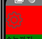
settingView의 왼쪽상단에 눌러지는 톱니바퀴 아이콘이 만들어졌습니다.
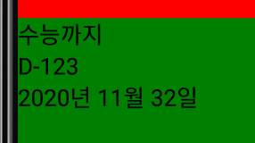
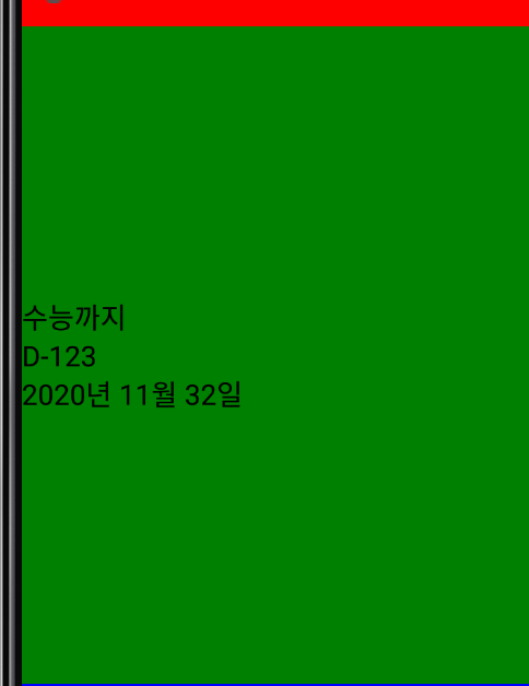
이제 DdayView를 구성하는 요소를 보겠습니다.
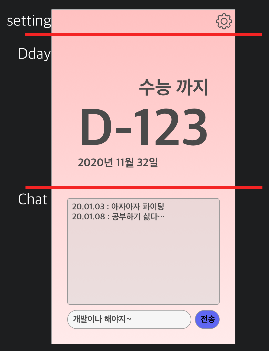
Dday의 제목 Text, Dday Text, dday 날짜 Text 총 Text 3개로 구성되어있네요.
//App.js
export default class App extends React.Component {

  render() {
    return (
      <View style={styles.container}>
        <View style={styles.settingView}>
          <TouchableOpacity>
            <Image source={require('./icon/setting.png')}/>
          </TouchableOpacity>
        </View>
        <View style={styles.ddayView}>
          <Text>
            수능까지
          </Text>
          <Text>
            D-123
          </Text>
          <Text>
            2020년 11월 32일
          </Text>
        </View>
        <View style={styles.chatView}>

        </View>
      </View>
    );
  }
}
이렇게 3개의 text를 추가해주었습니다.
다음 chatView에서는 채팅 로그를 보여주는 부분과, 채팅을 칠 수 있는 부분으로 나뉘어져 있습니다.
채팅 로그를 보여주는 부분은, 과거의 로그를 다 보여주고 싶기때문에 스크롤이 가능한 ScrollView로 구현할거에요.
그리고 채팅을 치는 부분은 이전에 배웠던 TextInput과 전송버튼이 있으니, TouchableOpacity가 다시 쓰이게 되겠네요.
//App.js
import React from 'react';
import { StyleSheet, Text, View, Image, TextInput,TouchableOpacity, ScrollView } from 'react-native';

export default class App extends React.Component {

  render() {
    return (
      <View style={styles.container}>
        <View style={styles.settingView}>
          <TouchableOpacity>
            <Image source={require('./icon/setting.png')}/>
          </TouchableOpacity>
        </View>
        <View style={styles.ddayView}>
          <Text>
            수능까지
          </Text>
          <Text>
            D-123
          </Text>
          <Text>
            2020년 11월 32일
          </Text>
        </View>
        <View style={styles.chatView}>
          <ScrollView>

          </ScrollView>
          <TextInput/>
          <TouchableOpacity>
            <Text>
              전송
            </Text>
          </TouchableOpacity>
        </View>
      </View>
    );
  }
}
ScrollView를 임포트 해주고 세가지를 chatView안에 작성해주었어요.
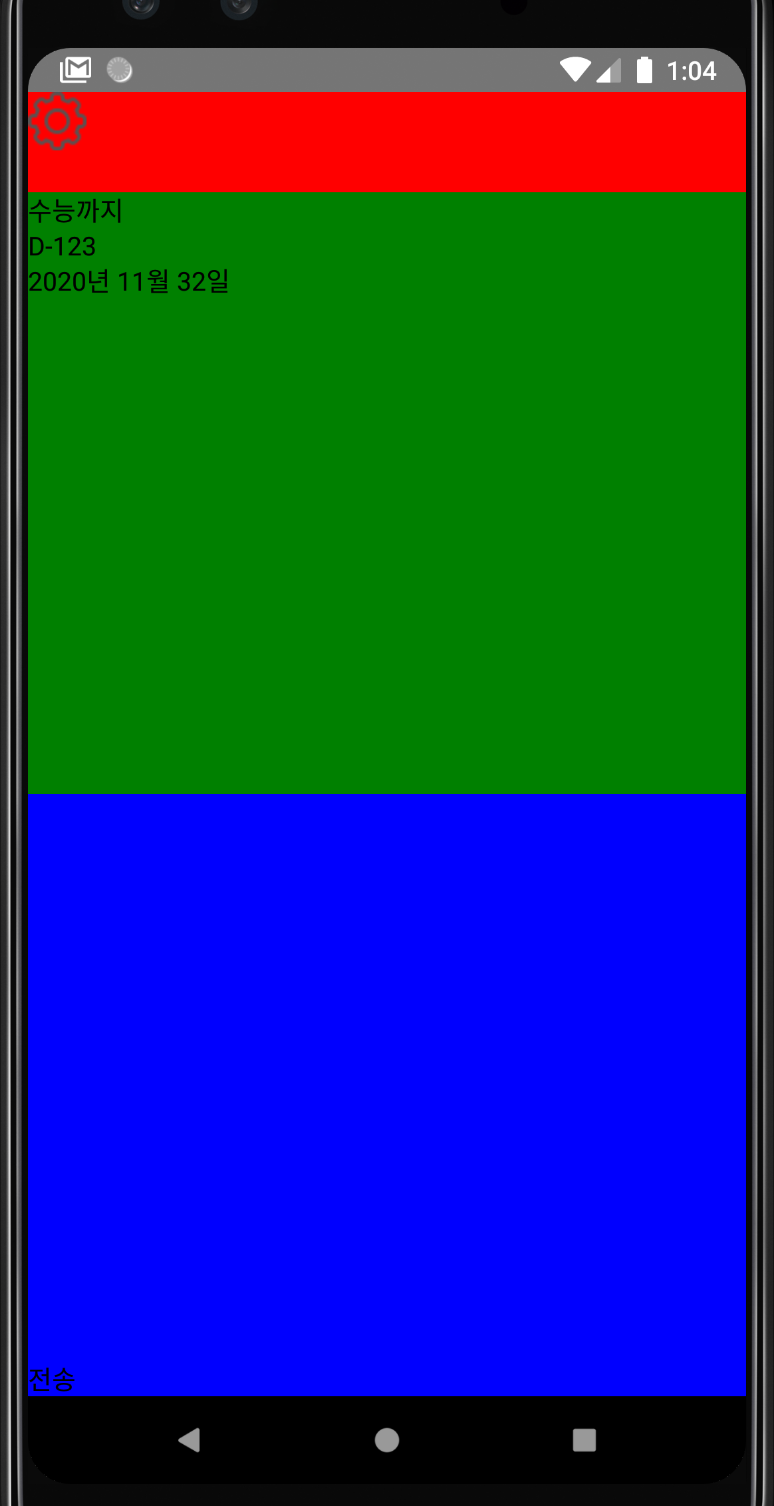
앞서 배운것 처럼 TouchableOpacity안에 Text가 들어있기 때문에 전송을 누르면 터치 효과를 볼 수 있습니다.
ScrollView와 TextInput은 현재 눈에 보이지는 않지만 렌더링 되어있습니다.
FlexBox
이제 생성한 컴포넌트들을 디자인했던 위치로 옮겨주어야 해요.
FlexBox를 이용해서 우리가 원하는 위치에 컴포넌트들을 배치할 수 있어요.
flexDirection
웹의 경우 기본값이 가로로 정렬입니다. A, B, C 이렇게 생성이 되는 반면,
앱의 경우 화면이 세로로 길기 때문에
A
B
C
이런식의 정렬이 기본값입니다.
이런 정렬방식을 바꿔주는 것이 flexDirection입니다.
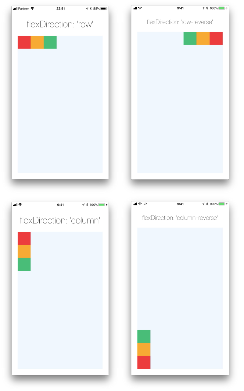
출처 : https://facebook.github.io/react-native/docs/flexbox (공식 문서)
현재 우리가 만들고있는 DdayView의 스타일에 flexDirection: 'row'를 줘보겠습니다.
//App.js
const styles = StyleSheet.create({
  container: {
    flex: 1,
  },
  settingView: {
    flex: 1,
    backgroundColor: 'red',
  },
  ddayView: {
    flex: 6,
    backgroundColor: 'green',
    flexDirection: 'row',
  },
  chatView: {
    flex: 6,
    backgroundColor: 'blue',
  },
});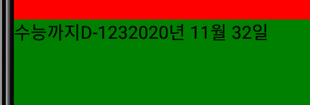
이렇게 가로로 정렬이 됩니다.
우리는 세로로 정렬을 할것이기 때문에 다시 지워줍시다.
justifyContent
정렬축 기준으로 각 요소들을 어떻게 배치할지 결정하는 옵션입니다.
앞서 얘기한 flexDirection이 row이면 가로축, column이면 세로축 기준으로 배치를 결정하게 됩니다.
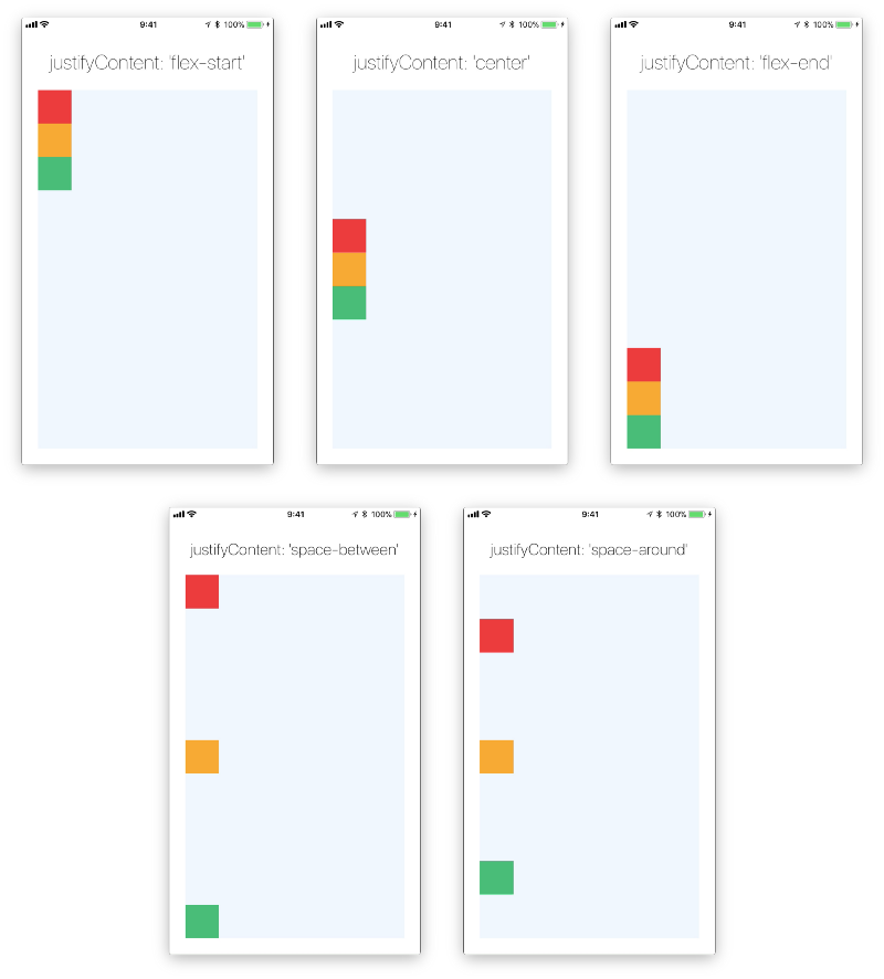
우리가 만들고 있는 부분에 적용해봅시다.
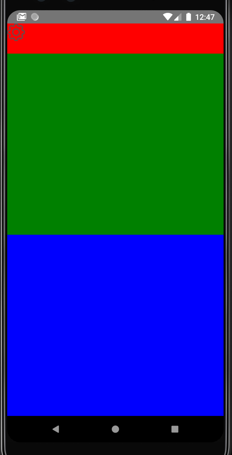
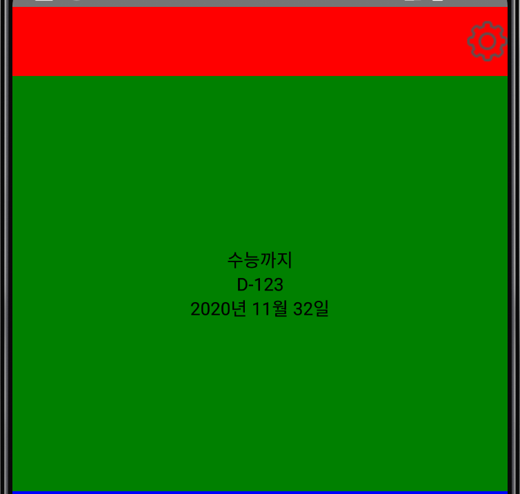
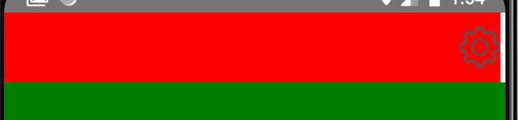
처음으로 settingView에서 현재 아이콘이 상단에 몰려있는 것을 센터로 맞춰주는 작업을 할 수 있겠네요.
settingView에 justifyContent: 'center'를 줘보도록 할게요.
이렇게 빨간박스에서 세로축 기준 중앙으로 이동한것을 볼 수 있습니다.
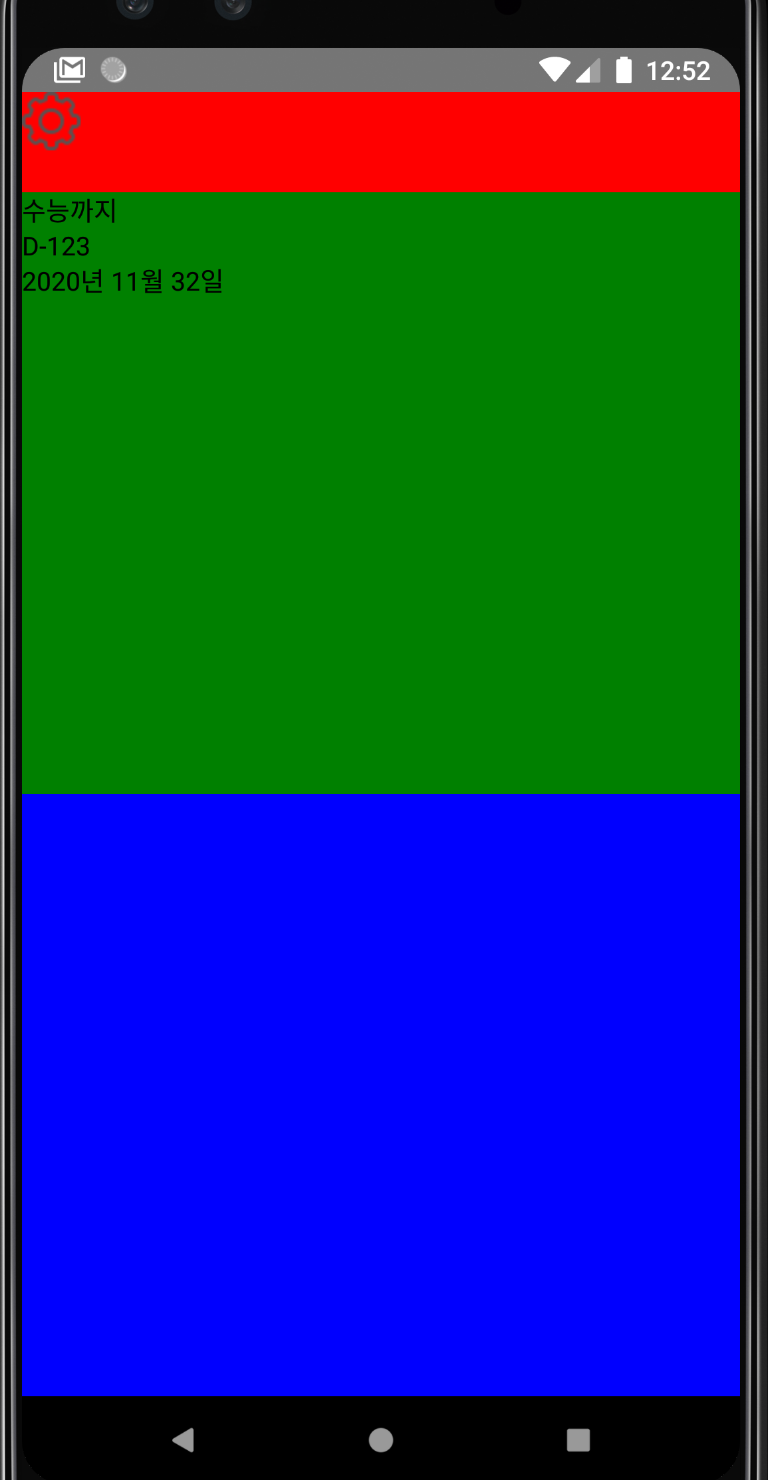
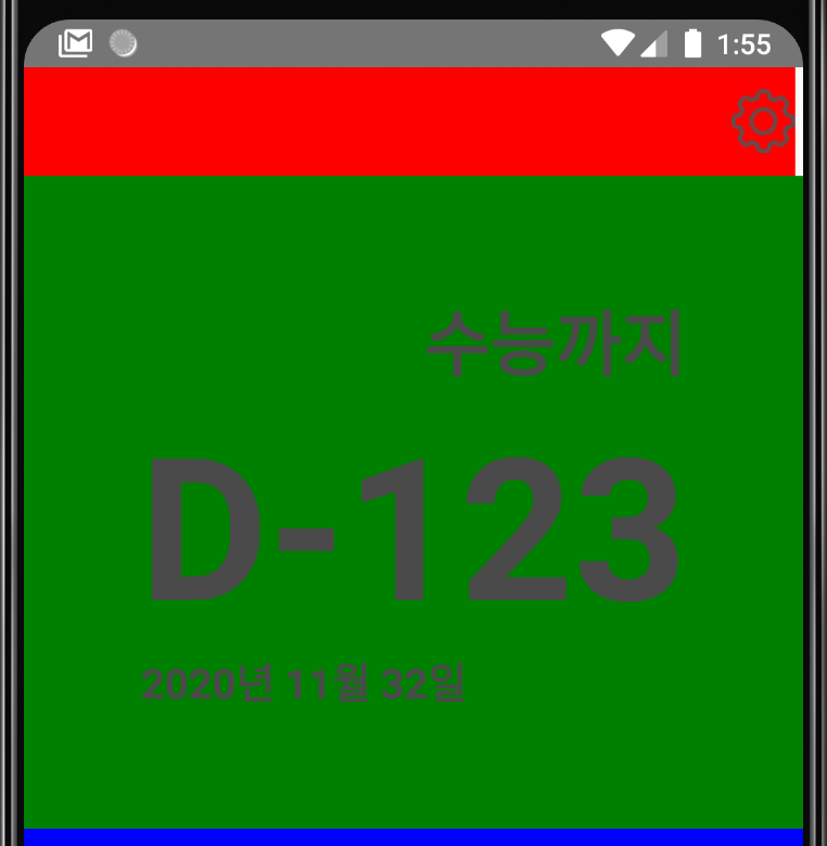
다음으로 DdayView의 3개의 텍스트들도 중앙으로 이동시켜 볼게요.
//App.js
const styles = StyleSheet.create({
  container: {
    flex: 1,
  },
  settingView: {
    flex: 1,
    backgroundColor: 'red',
    justifyContent: 'center',
  },
  ddayView: {
    flex: 6,
    backgroundColor: 'green',
    justifyContent: 'center',
  },
  chatView: {
    flex: 6,
    backgroundColor: 'blue',
  },
});
우리가 원하는대로 세로축이 중앙정렬되었습니다!
alignItems
앞서봤던 justifyContent와 수직인 축으로 정렬하는 방식을 결정합니다.
현재 가로축 정렬이라면, 세로축의 정렬을 결정하고
세로축 정렬이라면, 가로축의 정렬을 결정하게됩니다.
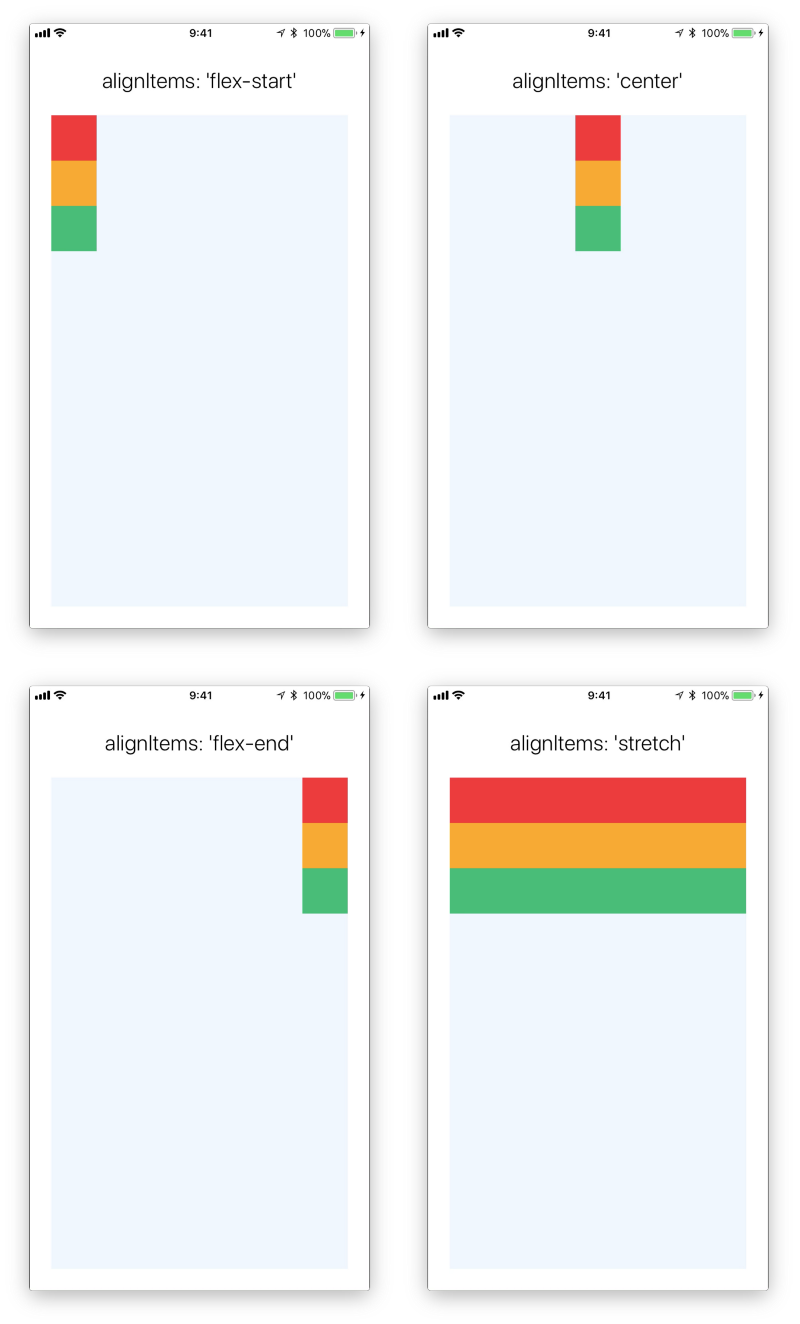
현재 settingView와 ddayView는 세로축 정렬이니 여기에 적용하면 가로축을 결정할 수 있습니다.
setting아이콘은 가로축의 젤 끝부분으로 이동시키고, 디데이 텍스트들은 중앙으로 이동시킬거에요.
settingView에는 alignItems: 'flex-end' ddayView에는 alignItems: 'center'를 적어보겠습니다.
이제 어느정도 우리가 디자인한 모습이 갖춰지고 있는것 같습니다.
alignSelf
이때까지 봤던 옵션들은 부모컴포넌트 입장에서 자식컴포넌트들을 정렬하는 방식이었습니다.
그 이유로 우리는 각 컴포넌트에 적용시킨게 아닌 각 컴포넌트를 포함하고 있는 settingView나 ddayView에 적용했습니다.
alignSelf는 alignItem과 같은 효과를 가지지만, 자식 컴포넌트에게 작성하여, 그 자식컴포넌트만 따로 지정해줄 수 있는 옵션입니다.
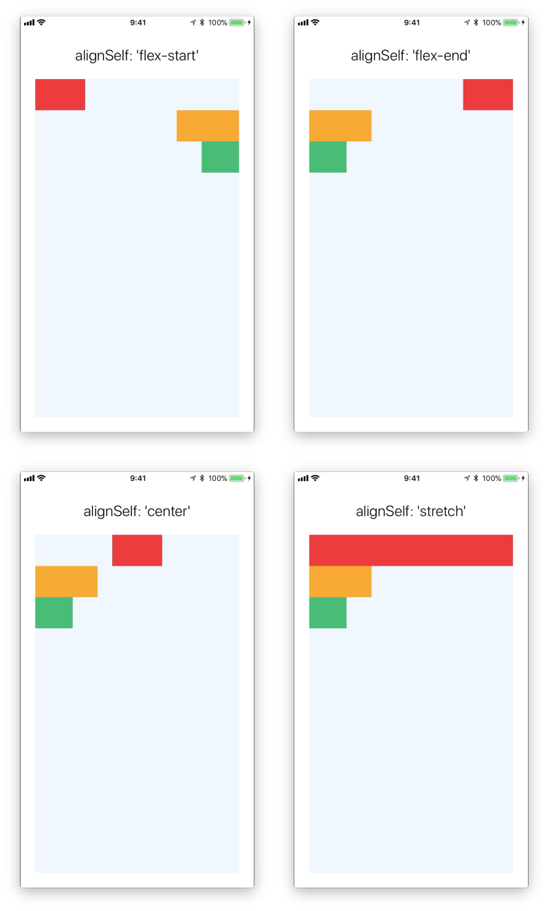
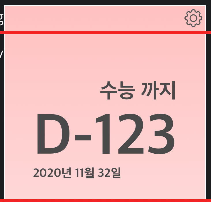
우리가 만들고자하는 dday화면을 보면, 가운에 dday는 중앙정렬이지만, 위의 제목과 아래 날짜는 각각 flex-end, flex-start입니다.
이를 구현하기 위해서 alignSelf를 이용해보겠습니다.
//App.js
import React from 'react';
import { StyleSheet, Text, View, Image, TextInput,TouchableOpacity, ScrollView } from 'react-native';
export default class App extends React.Component {
render() {
return (
<View style={styles.container}>
<View style={styles.settingView}>
<TouchableOpacity>
<Image source={require('./icon/setting.png')}/>
</TouchableOpacity>
</View>
<View style={styles.ddayView}>
<Text style={styles.titleText}>
수능까지
</Text>
<Text style={styles.ddayText}>
D-123
</Text>
<Text style={styles.dateText}>
2020년 11월 32일
</Text>
</View>
<View style={styles.chatView}>
<ScrollView>
</ScrollView>
<TextInput/>
<TouchableOpacity>
<Text>
전송
</Text>
</TouchableOpacity>
</View>
</View>
);
}
}
const styles = StyleSheet.create({
container: {
flex: 1,
},
settingView: {
flex: 1,
backgroundColor: 'red',
justifyContent: 'center',
alignItems: 'flex-end',
},
ddayView: {
flex: 6,
backgroundColor: 'green',
justifyContent: 'center',
alignItems: 'center',
},
chatView: {
flex: 6,
backgroundColor: 'blue',
},
titleText:{
alignSelf: 'flex-end',
},
ddayText: {
},
dateText: {
alignSelf: 'flex-start',
},
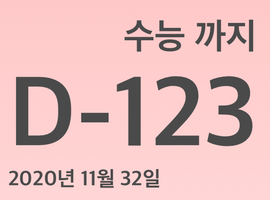
});각 텍스트의 스타일을 따로 만들어 준뒤, 텍스트에 적용시켰습니다.
앞서 얘기한 대로 제목은 오른쪽에 붙고, 날짜는 왼쪽에 붙게되었습니다.
텍스트의 스타일을 만지는 김에 폰트의 크기, 볼드체, 글씨 색도 조절해주겠습니다.
폰트의 크기는 fontSize 폰트의 굵기는 fontWeight 글씨 색은 color를 이용합니다.
//App.js
  titleText:{
    alignSelf: 'flex-end',
    fontSize: 36,
    fontWeight: 'bold',
    color: '#4A4A4A',
  },
  ddayText: {
    fontSize: 100,
    fontWeight: 'bold',
    color: '#4A4A4A',
  },
  dateText: {
    alignSelf: 'flex-start',
    fontSize: 21,
    fontWeight: 'bold',
    color: '#4A4A4A',
  },
margin
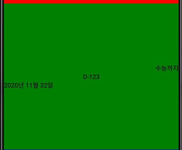
지금까지 만든 모습을 보면, 화면에 너무 붙어있는 것을 해결해주어야 합니다.
setting아이콘도 살짝 화면에서 떨어져 있고, 디데이 부분은 가운데 모이게 해주어야 합니다.
이를 구현하기 위해 margin을 주어야합니다. margin은 컴포넌트에 여백을 두어 원하는 만큼 떨어뜨릴 수 있게 해줍니다.
margin의 종류에는 marginBottom, Top, Left, Right, Horizontal, Vertical이 있습니다.
각각 아래, 위, 왼쪽, 오른쪽, 가로, 세로의 여백을 얼만큼 둘건지를 전달해주면 됩니다.
우선 settingView에 marginRight를 1%정도 주겠습니다.
  //App.js
  const styles = StyleSheet.create({
  container: {
    flex: 1,
  },
  settingView: {
    flex: 1,
    backgroundColor: 'red',
    justifyContent: 'center',
    alignItems: 'flex-end',
    marginRight: '1%',
  },
그리고, 제목 text에는 marginRight를 15% 날짜 text에는 marginLegt를 15%주겠습니다.
 //App.js
   titleText:{
    alignSelf: 'flex-end',
    fontSize: 36,
    fontWeight: 'bold',
    color: '#4A4A4A',
    marginRight: '15%',

  },
  ddayText: {
    fontSize: 100,
    fontWeight: 'bold',
    color: '#4A4A4A',
  },
  dateText: {
    alignSelf: 'flex-start',
    fontSize: 21,
    fontWeight: 'bold',
    color: '#4A4A4A',
    marginLeft: '15%',
  },
});
이제 chatView를 제외하곤 레이아웃 작업이 끝났습니다.
다음글에서는 chatView를 작업하고, state에 대해서 알아보겠습니다.
'Develop > React-Native' 카테고리의 다른 글
| [#4 레이아웃 구현 마무리하기] 환경 구축부터 스토어 출시까지 디데이 앱 따라 만들며 배우는 React Native (2) | 2020.09.30 |
|---|---|
| release 버전에서 axios 에러가 발생하는 경우 (1) | 2020.09.03 |
| [1일 1깡 어플] 1일 N깡이 출시 되었습니다~~! (1) | 2020.05.24 |
| [#2 Component와 메인화면 분할] 환경 구축부터 스토어 출시까지 디데이 앱 따라 만들며 배우는 React Native (2) | 2020.01.20 |
| [#1 리액트 네이티브 맛보기] 환경 구축부터 스토어 출시까지 디데이 앱 따라 만들며 배우는 React Native (1) | 2020.01.20 |